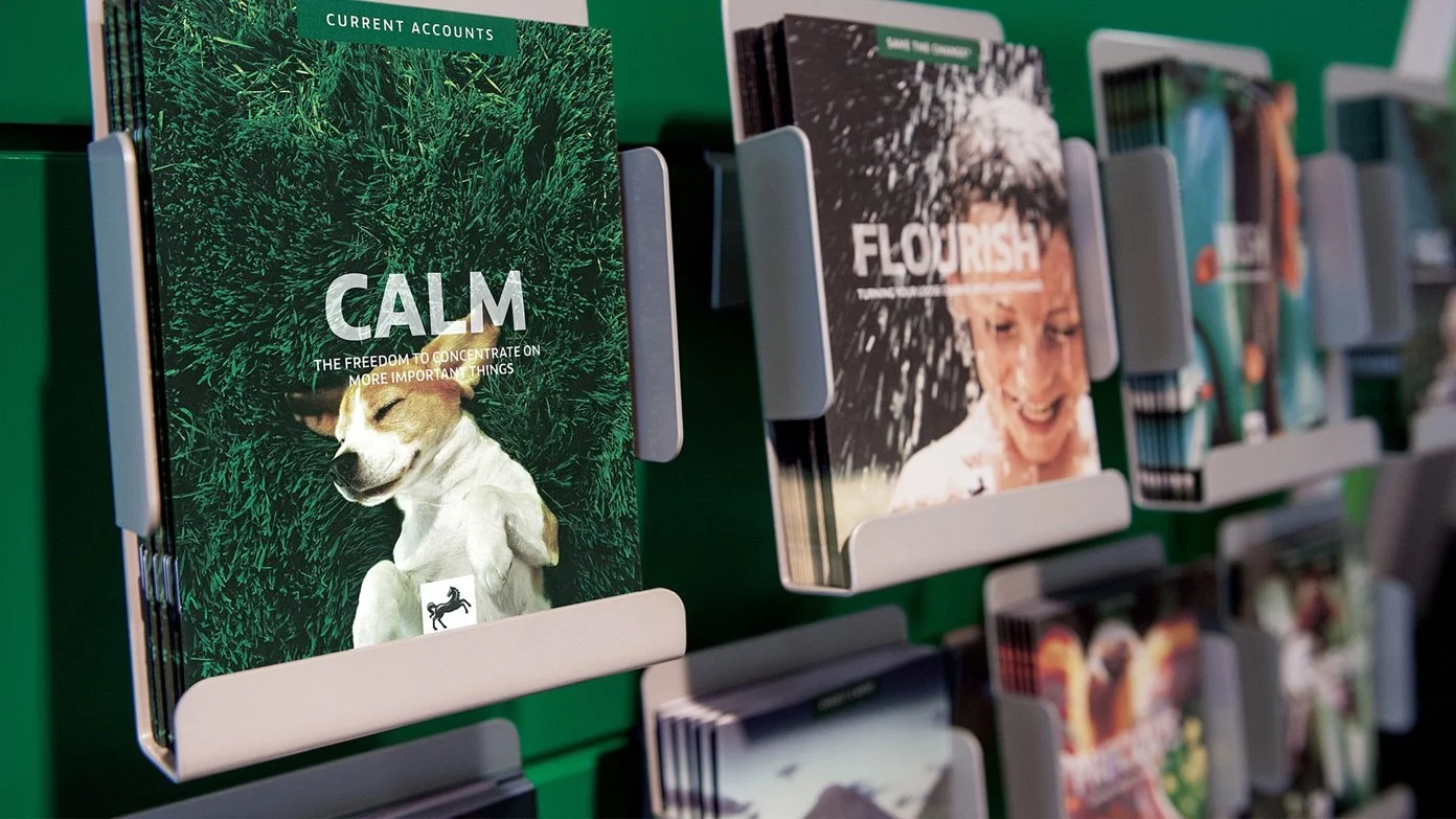
Global rebrand
Some government legislation meant that LloydsTSB had to downsize significantly. They reformed TSB as a standalone bank, and Lloyds became Lloyds Bank once more.
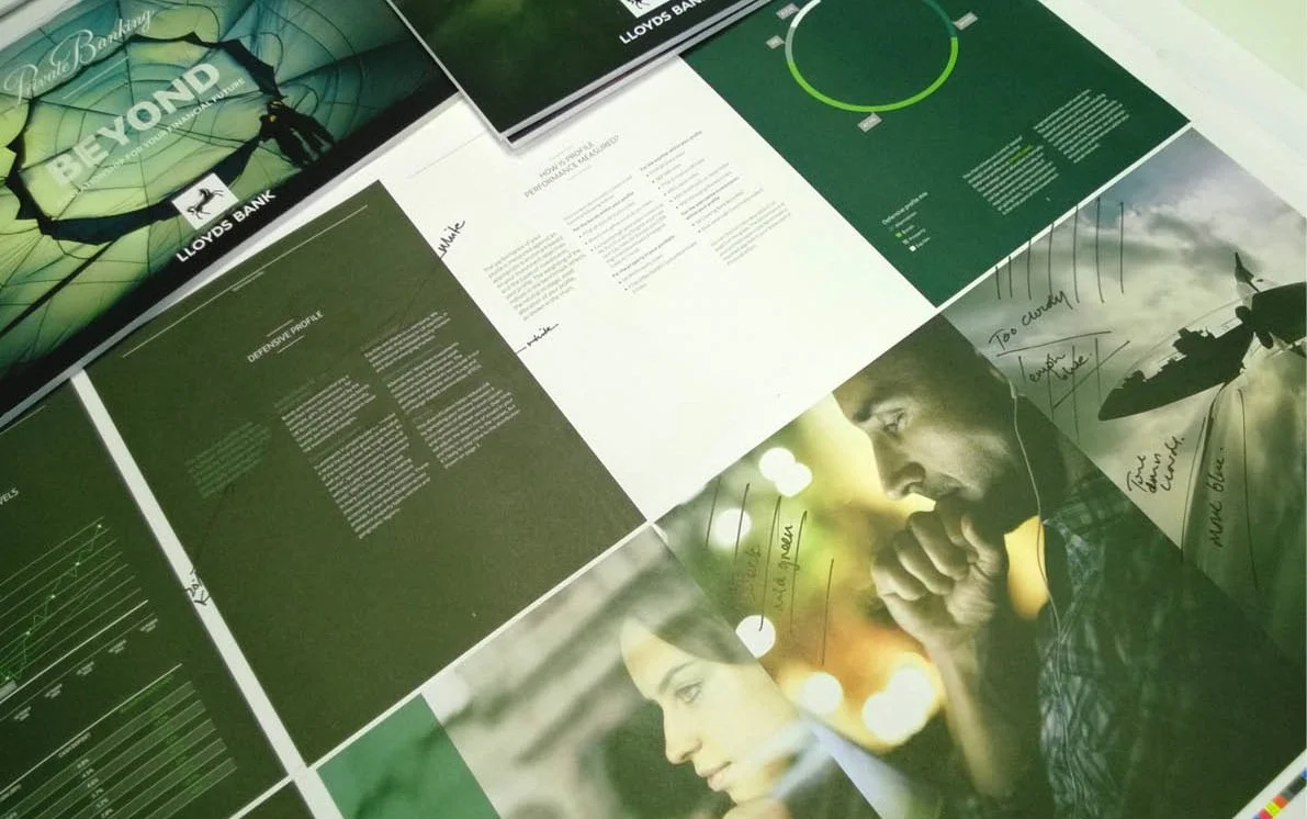
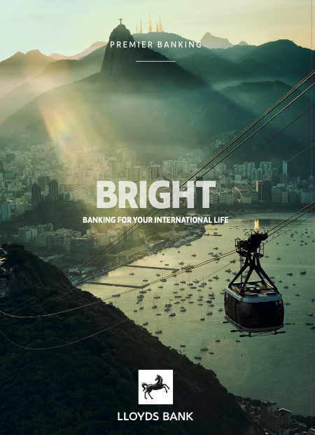
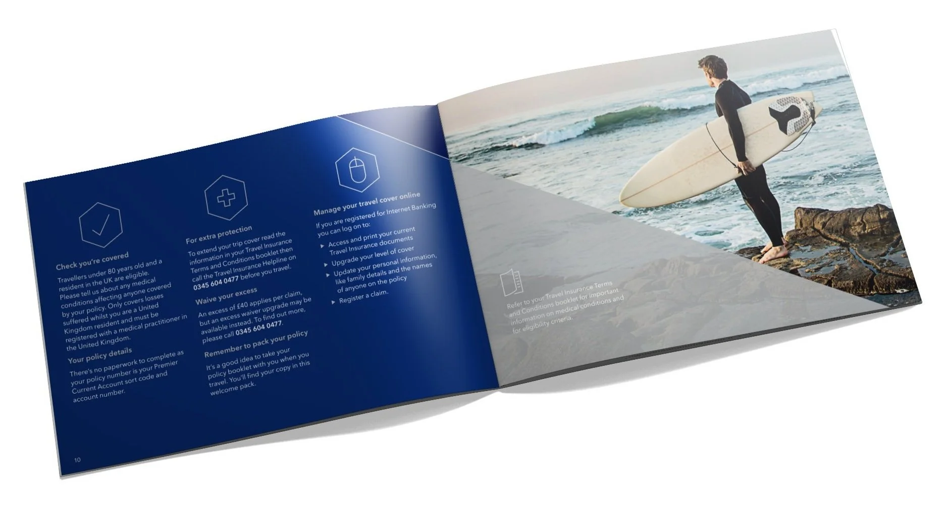
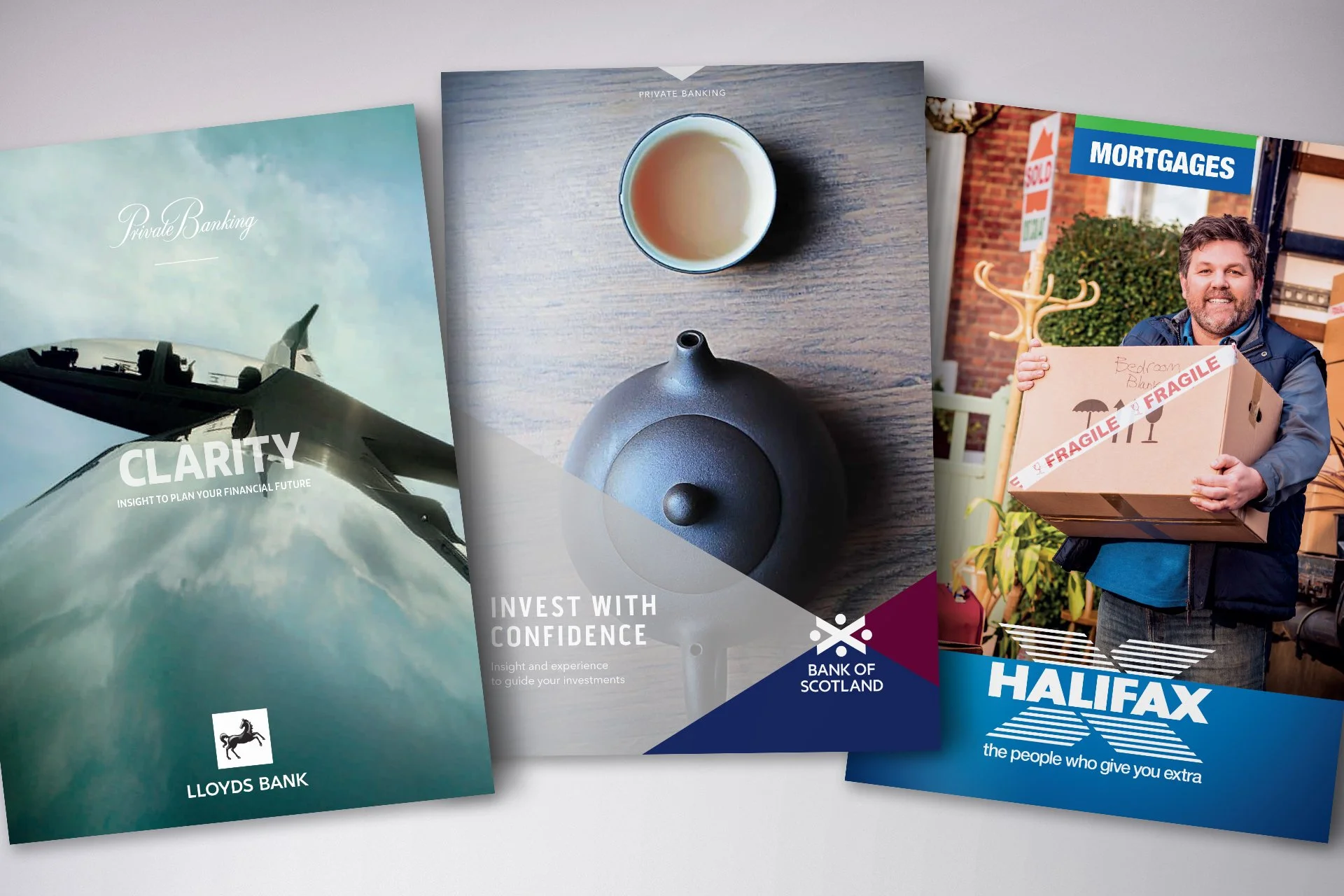
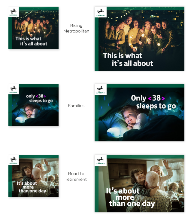
I was tasked with the design direction for all below the line print collateral, including sourcing over 1000 images.
The project was a collaboration between many agencies including, Rufus Leonard, RaineyKelly, ProximityLondon, and Adam&EveDDB.
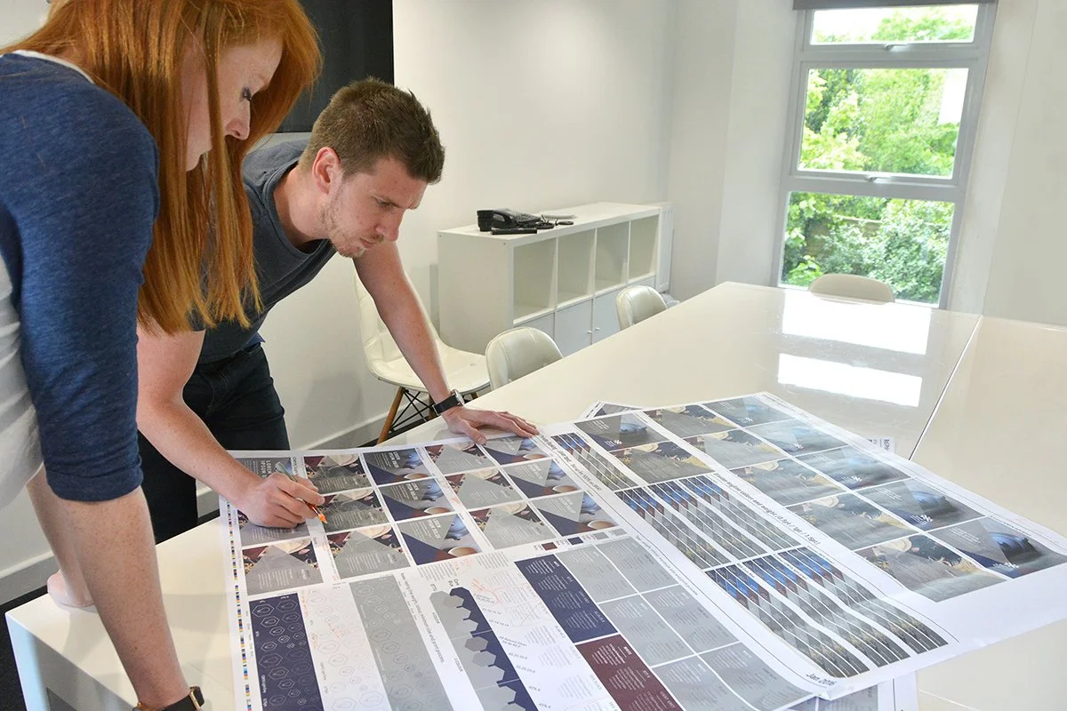
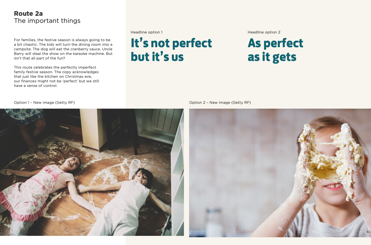
As design director, I led my team to source imagery and define the art direction, test and spec colours including metallic specials, finalise typographic details, create a suite of icons. All while developing tone of voice in conjunction with the other agencies and writing content for the new material in the new tone of voice.
It tested just about every string in a creative’s bow and was a hugely successful collaboration among agencies that I’ve never experienced in the same way since.
Lloyds Banking Group also comprised Bank of Scotland and Halifax. It was seen as a bit of a bonus to refresh both brands at the same time, culminating in a project that tripled the size of my team over a 12-month period.
Lloyds Bank International Banking explainer
These videos were added value we delivered for the client who needed “something” to help communicate the international offer, and to help progress the skills of my team who were keen to do more motion work.
With ‘no budget’ we took still imagery from the library we had built up and created cinemagraphs and parallax effects to create interest for the typically lengthy compliance-mandated voiceovers.
Bank of Scotland International Banking explainer
The aspects of a creative director role that never get talked about – pragmatism and compromise to make something from nothing, while giving the team enough of a challenge to push their skills on and still create something you’d attach your name to.
For the journey
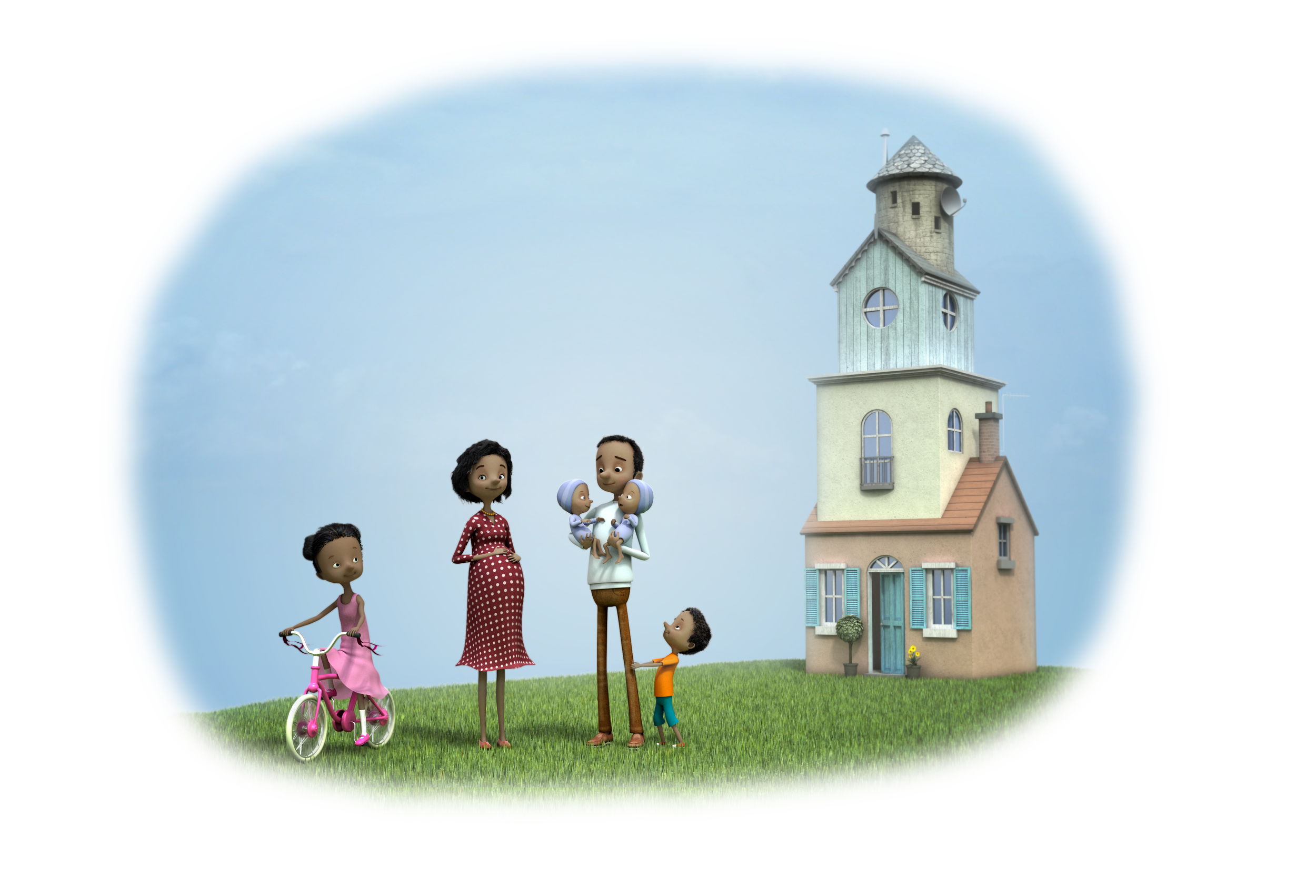
It was a great project to be part of. I’d worked on the old LloydsTSB characters previously which I was sorry to see go. And now, Lloyds have rebranded again, and honestly look better than ever. The new brand feels like the one designers have been given more latitude to play with and create a visual language with the horse, which was completely off limits to us.
This project was completed while at Six.


